MARKETING & BRAND DESIGN
LendingTree Homepage Redesign
Role: Creative Director
The Challenge:
The LendingTree homepage failed to clearly communicate what LendingTree is, who it is for, or what a visitor should do next, undermining both brand trust and conversion.
The Outcome:
+18% Form Start Rate | +7.5% Session CVR
Leadership aligned on a strategic imperative: the LendingTree homepage needed to be rebuilt from the ground up. The page had to accomplish four things. Build trust. Clearly explain LendingTree's role as a financial marketplace. Guide users toward their best next step. And set honest expectations for what the experience would deliver. My team owned the design, look, feel, content, and storytelling of everything shown on the page.
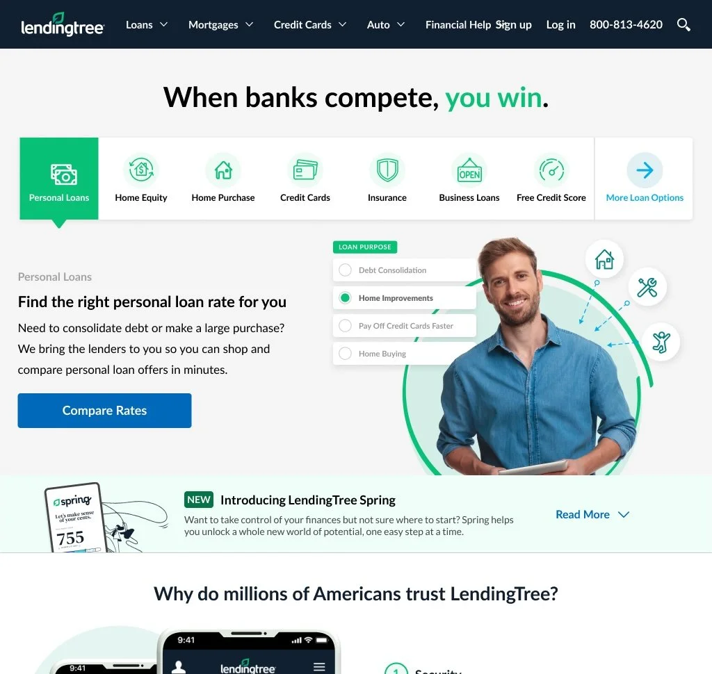
The Old Homepage
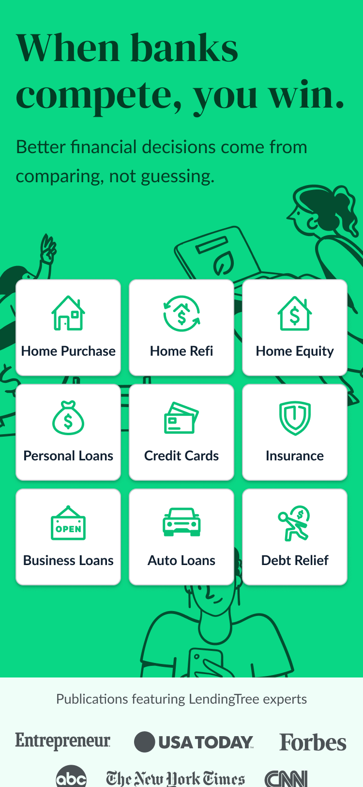
The original homepage had accumulated years of additions without a unifying design vision. Several problems stood out.
The brand story was absent. A visitor landing on the page for the first time had no clear sense of what LendingTree actually is or why they should trust it. The value proposition was buried rather than led with. The phrase "When banks compete, you win" had long been the brand's north star, but the page did not build a compelling case for it.
The navigation and information architecture worked against users. Product categories were accessible but the hierarchy was unclear, making it difficult for someone in the early stages of a financial decision to understand where to go or what to do first.
The visual design felt dated and inconsistent. Sections competed with each other rather than guiding the eye. There was no clear primary action, no emotional grounding, and no sense that this was a brand with a distinct point of view.
The page also carried a transactional tone that felt at odds with where the brand was trying to go. It read like a lead generation tool rather than a destination a consumer would trust with an important financial decision
The Process
Three concepts. Three weeks. One shot to get it right in front of the leadership committee.
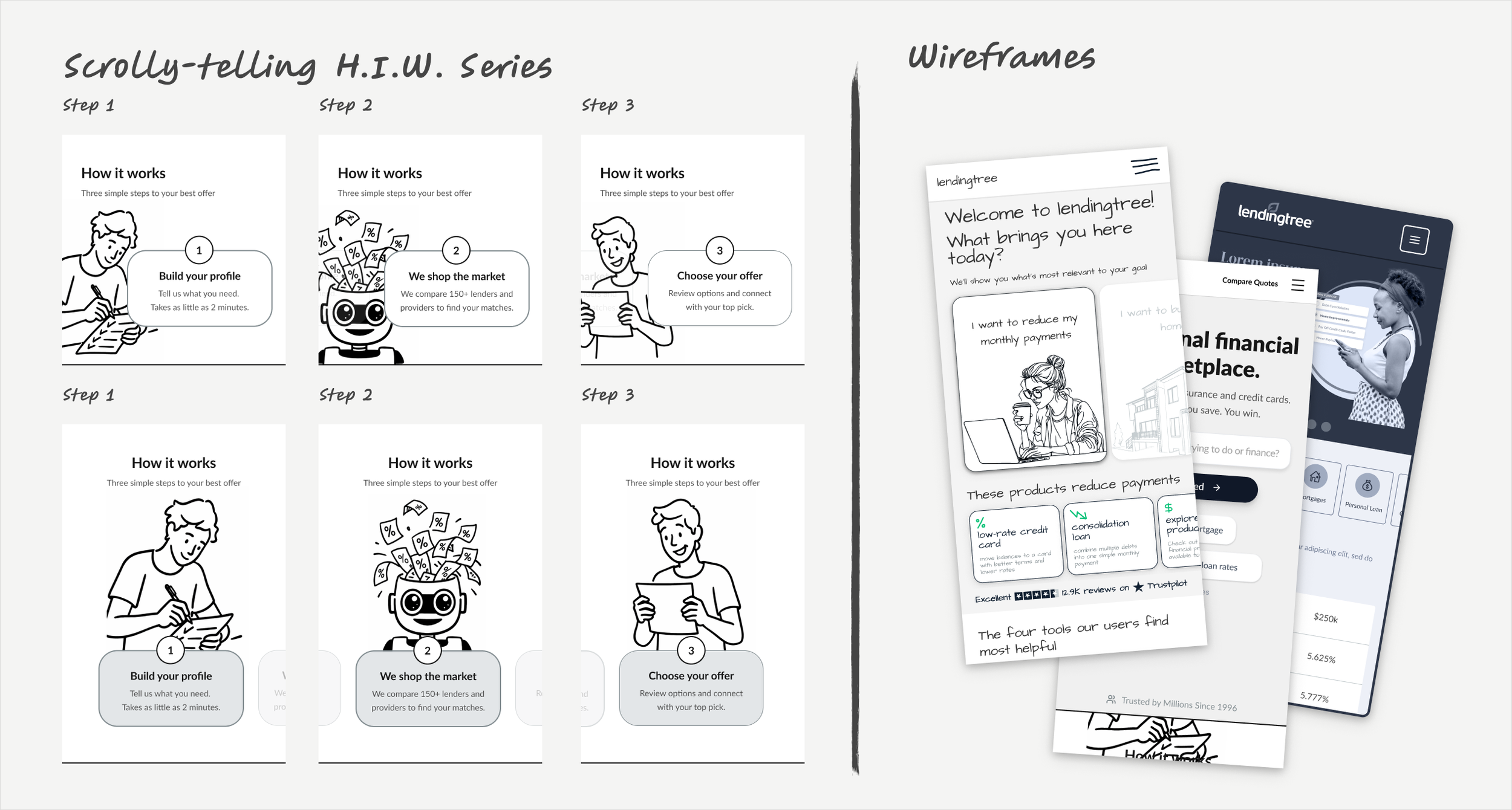
The timeline was aggressive by any standard. With less than a month to deliver fully realized homepage concepts to senior leadership, this was an all-hands situation from day one. Rather than work sequentially, I directed the team to move in parallel, pairing copywriters with designers at every stage so that messaging and visual thinking developed together, not one after the other.
The process started with a focused wireframing phase, using it to generate ideas quickly, pressure-test different approaches, and make fast decisions about what was working and what was not. That discipline paid off. We kept what had legs and cut what did not, which gave the visual design phase a clear foundation to build on. A second pairing of designers and copywriters then took those strongest directions into full visual execution.
The result was three completely distinct, fully developed concepts delivered to the leadership committee in three weeks, each representing a genuine creative direction. The committee evaluated each concept against their strategic goals for the homepage and selected the direction that best aligned with where the brand was headed.
Throughout the entire process, my team were working directly and continuously with both brand and engineering. Brand alignment was built into how we worked from the start. And engineering was kept close throughout so that by the time a final direction was chosen, there were no surprises about what was coming.
Fast, collaborative, and delivered on time — that is how my team operates under pressure.
The Redesign
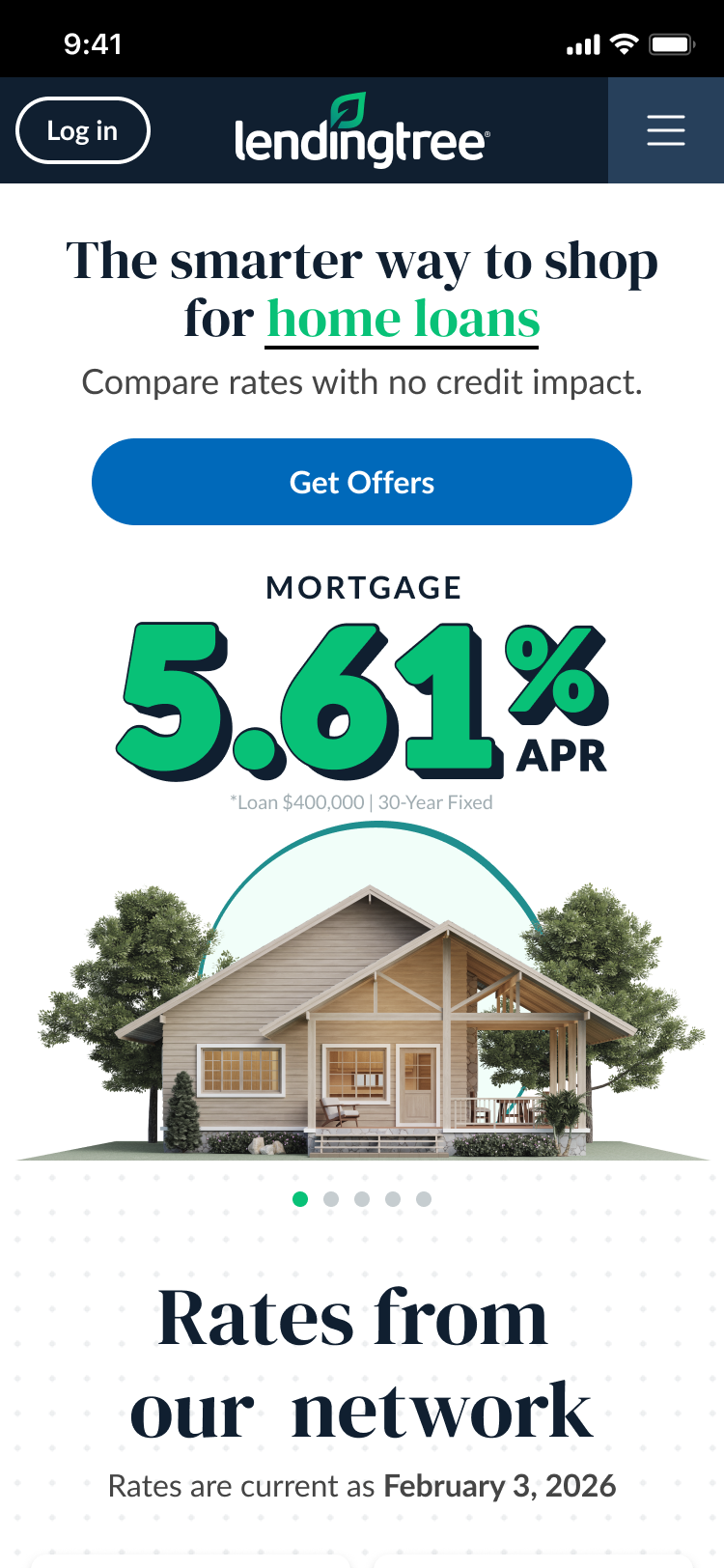
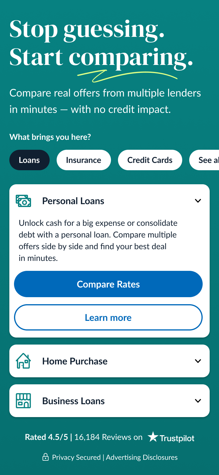
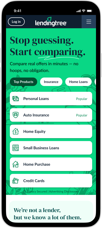
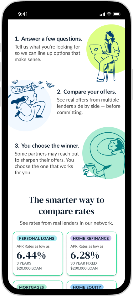
The new homepage opens with confidence. "Stop guessing. Start comparing." is a direct, benefit-led headline that immediately communicates what LendingTree does and what a user gets from it. No hoops, no obligation. The promise is clear from the first line.
The navigation was restructured to reflect how consumers actually think about financial products, making it easier to orient and route users intelligently from the moment they arrive. Top Products anchors the experience and gives users a clear starting point.
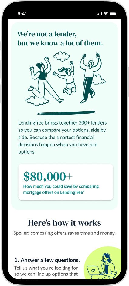
The redesign introduces a stronger editorial voice throughout. The "Here's how it works" section demystifies the process in plain language, reducing anxiety for first-time visitors who may not understand how a marketplace model works. This directly addresses the trust gap the old site left open.
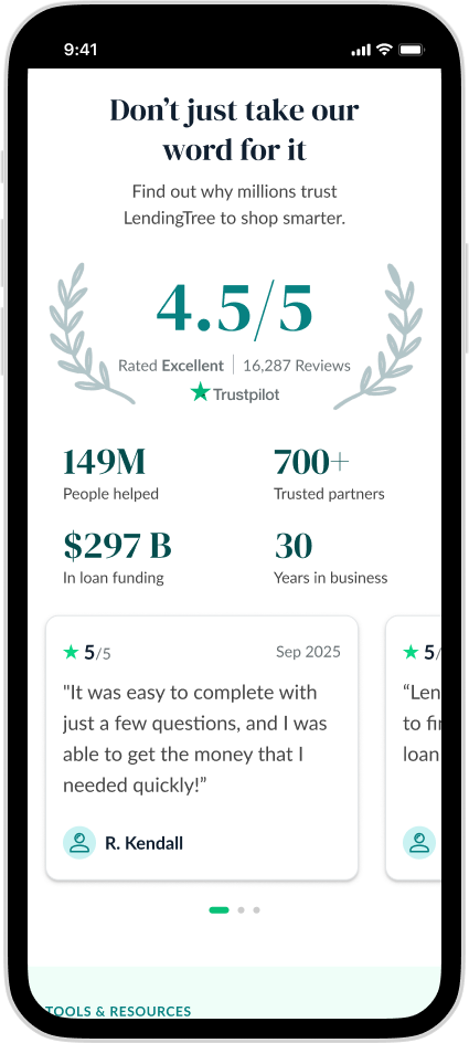
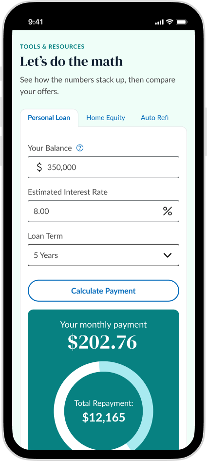
Social proof is elevated and made more specific. Real numbers, real reviews, and real outcomes that give the brand claim something concrete to stand on. The "Don't just take our word for it" section earns its place rather than feeling like a checkbox.
The visual language is cleaner, warmer, and more intentional. Sections breathe. The hierarchy is obvious. And the page now reads as a brand destination first, a conversion tool second, which makes it more effective as both.
The redesign delivered measurable business impact within weeks of launch. Form start rate climbed 18% which showed users were engaging with the new experience and taking action at a meaningfully higher rate. Session conversion rate rose 8%, and revenue per session also increased. A cleaner, more intentional brand experience did not come at the cost of performance — it drove it.
The outcome
Form Start Rate
+18%
Session CVR
+7.5%
Rev. per Session