PRODUCT DESIGN
LendingTree App
Role: Creative Director & Lead Designer
Responsibilities: Art Direction and UI Design
The Challenge: LendingTree's logged-in experience had been built around lending. Redesigning the app meant shifting the entire product narrative from transactions to financial wellness, and doing it in a way that felt personal, clear, and worth coming back to.
The Outcome: +32% NPS Score
The brief was ambitious: reimagine what a user sees after they log in to LendingTree. The existing experience was functional but transactional. Users wanted something more personal, more motivating, and more useful.
I came into this project in a dual role, serving as both Creative Director and lead UI designer. That meant I was not only setting the creative direction but also doing the hands-on design work, working directly alongside product managers, UX designers, researchers, and engineers throughout the entire process.
The Old Experience
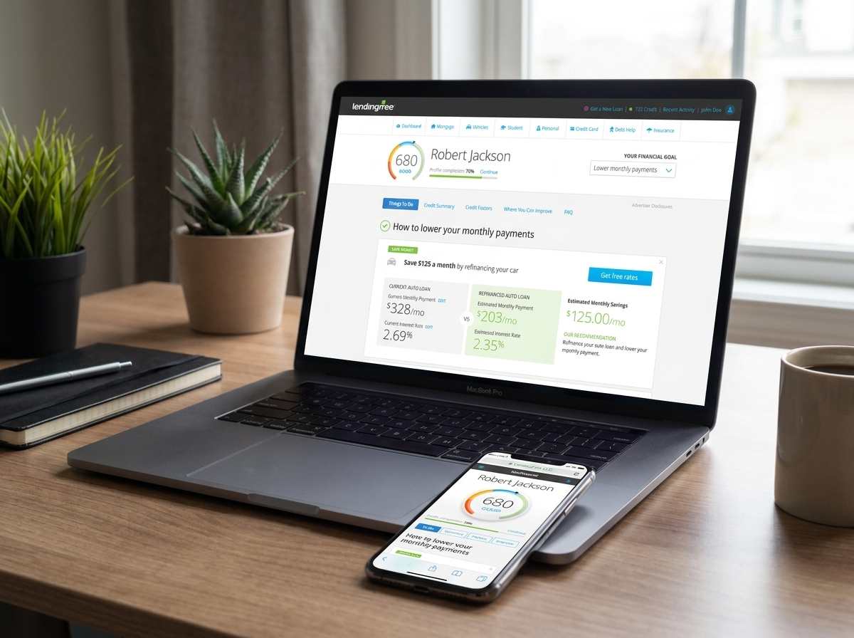
The previous logged-in experience was built around LendingTree's products, not the user sitting in front of them. The dashboard led with a credit score and immediately pivoted to a task list without ever giving the user a clear sense of their overall financial picture or what it meant for them personally.
The information architecture reflected how LendingTree thought about its business rather than how a user thinks about their finances. Navigation was organized by product category, which made sense from a lending marketplace perspective but put the burden on the user to know what they needed rather than guiding them toward what would actually help.
Personalization existed but felt surface-level. The experience could tell you your credit score, but it could not tell you in a meaningful way what that meant for your financial future or what to do next. Recommendations were surfaced, but they read as product pitches rather than genuinely personalized advice.
The net result was an experience that felt transactional and fragmented. Useful information was there, but it required the user to assemble the picture themselves. There was no emotional clarity, no sense of forward momentum, and no compelling reason to come back unless you needed a loan.
Collaboration
A redesign at this level does not happen in isolation. I worked directly and continuously with product managers to ensure the design served the product strategy, with UX researchers to pressure-test how real users were responding to the concepts, and with engineers to make sure what we were designing could actually be built without compromise. The dual role I played — creative director and UI designer — meant I could make decisions faster and keep the vision intact from concept through to production. There was no translation layer between the design intent and the design execution. That is a rare advantage on a project this complex, and it showed in the final product.
The Redesign
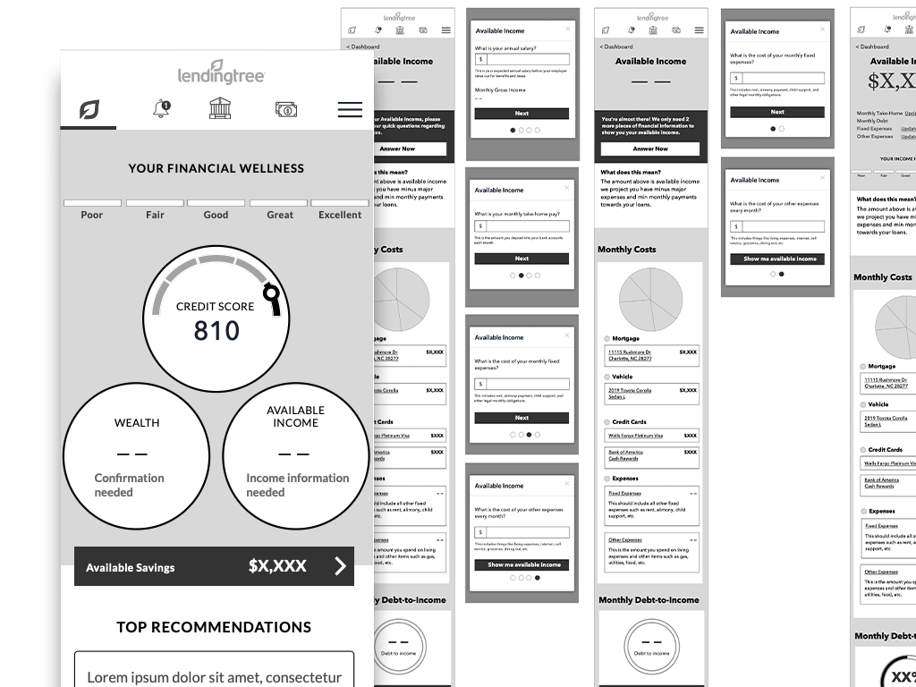
The central design decision was to lead with financial status rather than product offerings. The redesigned home screen greets users with a clear, immediate read on where they stand — credit score, financial future, and cash flow — organized visually so the relationships between those numbers are intuitive rather than something a user has to work out on their own.
The gauge at the top of the screen gives users a single, at-a-glance status. It answers the question every user is really asking when they open a financial app: am I doing okay? That kind of clarity builds trust and brings users back.
Available savings opportunities are surfaced proactively and tied directly to the user's actual accounts, making the value LendingTree provides concrete and immediate rather than theoretical. The "Top Ways to Improve" module gives users a clear next action without overwhelming them, keeping the experience motivating rather than anxiety-inducing.
Throughout, the visual design was built to feel premium and personal — dark backgrounds, clean typography, and a color system that communicates status at a glance without requiring the user to read a single label to understand what they are looking at.